Equity Investment Journey - Equity Market – Axis Direct
Dec 24, 2019 | Source: AxisDirect-O-Nomics
Charts and ratios to start your equity investment journey
The views and opinions expressed are of Mr. Arun Thukral, MD & CEO, Axis Securities.
For many investors new to the world of equity investment, their experience or perception of the stock market can be summed up in three simple words: Scary, overwhelming and intimidating.
If you grew up watching Hollywood flicks that show slick and rich share traders dishing out lines such as “That’s all the market is, one giant casino,” you are in for a rude shock. No, the stock exchange is not a giant casino and you are not Nick Leeson from Rogue Trader. And yes, there is nothing to fear if you are armed with knowledge.
Equity investment is backed by science. That’s why we have ratios, charts, technical analysis, charting tools, software and what not.
So, let’s start with the basics. Why basics? Because we assume you are a new investor in the stock market. Here are 6 must-know charts and ratios to help you kick-start your investment journey.
3 Important Financial Ratios
1.Price-to-earnings ratio (P/E ratio)
P/E ratio helps us measure the value of a company by comparing the price of its stock to its earnings.
P/E is calculated by dividing the price of the share by the company’s earnings per share.
Price-to-earnings ratio in the simplest terms means how much you are paying for each rupee that the company earns. A low P/E ratio is not inherently bad or a high ratio doesn’t make a company good. However, a low P/E ratio may indicate that investors are losing confidence in the share and selling them. These activities drive the share prices down even when the earnings are steady.
2. Current Ratio
The current ratio is also an important parameter for investors to look at because it shows the company’s ability or inability to pay off its current or short-term debts and liabilities. The company must have enough current assets that can be easily converted to cash within a year to pay off its debts and obligations.
Current assets may include inventory, accounts receivables, cash, securities and prepaid expenses. Current liabilities are short-term debts, accrued liabilities, accounts payable, as well as other debts.
Calculating current ratio is simple.
A current ratio below 1 is a red flag for creditors. They will stay away from such a company because it doesn’t have enough current assets to pay off its short-term liabilities. A current ratio of more than 1 is a healthy sign.
You should stay away from a company with a low current ratio if you want to become a value investor and get ‘Warren Buffet-rich’.
Return on equity ratio (RoE ratio)
RoE and RoCE (Return of Capital Employed) is frequently referred to by the iconic Warren Buffet. Buffet is an American business tycoon, investor and philanthropist and you can be rest assured that his advice is sound and reliable.
So, in a nutshell, RoE ratio shows how a company’s asset is being effectively managed to generate profits. A good or bad RoE can be determined by comparing the company along with its peers. For example, if you are looking at the RoE of a utility company, you should not compare it with a company in the banking sector.
Return on equity ratio is calculated by dividing the company’s net income by its average shareholders’ equity.
3 Important Stock Market Charts
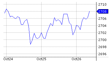
Line charts
Line charts are the simplest form of stock charts available for technical analysis. It plots the closing price of a stock over time – weeks, months and years. Reading a line chart is easy and it is useful in in-depth technical analysis such as identifying trend lines, support and resistance levels and chart patterns.
An example of a simple line chart
Bar charts
While a line chart only shows the closing price of a stock, the bar chart displays the opening price, highs, lows and closing price of the stock during a certain period – day, week, month, year, etc. Bar charts are very popular with both share traders as well as value investors.
Bar charts are color-coded to make it easy to read and analyse. For example, if the closing price of a stock is above the opening price, it is colored black or green. If its closes below, it’s colored red.
An example of a bar chart
Candlestick charts
Have you seen a candlestick with wicks on both the ends? That’s how a Japanese candlestick looks like. The good thing about a candlestick chart is that it explains the day’s or the week’s highs, lows, opening price and closing price with a simple candle.
Here’s how….
If a candlestick’s body is black or red, the stock price closed lower than the opening price. If the body is white or green in color, it signifies that the closing price was higher than the opening price.
Apart from these six financial ratios and charts, there are a lot more to learn about equity investment. However, if you want to really want to succeed in the stock market, you need to take the first step and get a first-hand experience of how things work in the equity market.
If you do not have the risk appetite for equities but your goal is to earn decent returns, you can choose Axis Direct’s 3-in-1 Savings, DEMAT and Trading account, which opens up investment opportunities for you in IPOs, Mutual Funds, ETFs and much more! If you are not confident enough to take market-linked decisions all by yourself, Axis Direct also has market experts to guide you through every step of the process and ensure that you maximise your returns.
vV5.0.0.6-60
Thanks for Liking, Please spread your love by sharing...
As you have logged in from a different device/browser. This session has
expired.


 INDIA
INDIA NRI
NRI